With the current development trend, kindergartens meet more and more quality standards. Because most parents want their children to be taught the best from a young age. That is why the kindergarten logo design is a pretty important thing for schools.
To promote the image, most kindergartens build a unique brand identity that helps convey the message to parents most easily.
Why is preschool logo design important?

You need How to desgin a beautiful logo? Preschool field because it helps to build brand image in the eyes of parents. In addition, it helps the school to communicate the messages and goals it wants to reach.
Stand out from other kindergartens in terms of brand image
Helping the school to promote the image easily, showing professionalism from image to service quality.
The preschool logo designs help schools build brand identity products such as boards, clothes, school supplies ... This is an important factor when building the image of the school.
Some notes when designing a kindergarten logo:
Color:
With the target audience being preschool students, you need to pay attention to choose bright, youthful colors such as pink, yellow, blue, etc. Besides, you need to avoid colors like black, gray, etc. Brown,..
Font:
Soft, lovely typefaces are more suitable than stiff typefaces and have a slightly "serious" look.
Pattern:
Cartoon patterns with plants, flowers, and animals are common designs for preschool logos, so take advantage of this!
Note: Avoid logos that are too abstract: With the criteria of being friendly, easy to understand and for children, you should avoid too abstract logos to get closer to customers and increase brand recognition. mine.
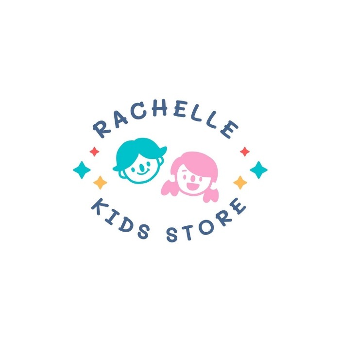
Some sample preschool logos:
![]()
![]()
![]()

To get a beautiful and professional preschool logo, contact Banoca for advice design logo, in the most professional way. Hotline: 091.129.5102